
The Newcastle crest has been part of my life for as long as I can remember. I wore it with pride as a little boy, played football in the streets in it and years later celebrated with 300,000 fans in it after winning the Carabao Cup. For a lot of us growing up, it was practically a uniform. So when the new crest appeared on screen this morning, the fan in me got there first. Then the designer in me caught up and that’s where the dilemma comes in.
The designer’s view
The old crest had definitely done its job over the years and I’ll always love it. It tells a story of the city of Newcastle and is instantly recognisable…but if it had been brought to me to critique, I’d have certainly suggested a few tweaks here and there. At very small sizes it lost clarity due to the intricate detail and when blown up huge the lion, for example, looks as messy as our defence on a cold Monday night at Elland Road. The ability to alter the size or use the logo across a variety of media matters far more now than it did when the old one was designed around 1988. Today a badge must work as a tiny app icon, a social avatar, on a stadium facade and emblazoned across a shirt all at once.
The new one just works. It’s clean, it holds up at smaller size and has impact whether on a shirt, a phone screen or three storeys high on the front of St James’ Park. That matters commercially too, because a crest that works everywhere can go everywhere. What I love most is that they left the bones of it alone and the changes made are considered, not just cosmetic. It remains the city’s coat of arms, so it still looks like “our” badge and as a designer I respect that. The hardest part of any redesign is knowing what to leave alone…and being brave enough to keep or even protect it.
The fan’s view
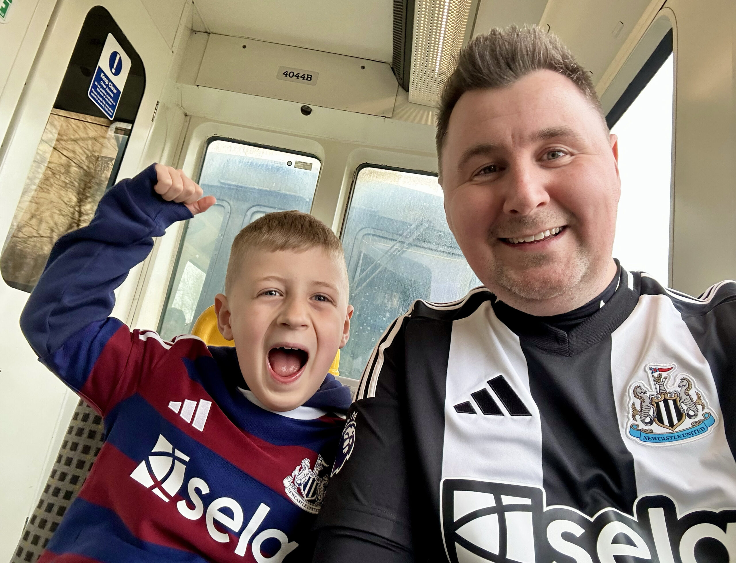
Being honest, I’ve always wanted it to change, but been mindful of what it means to so many people. Every fan has their own memories tied up in that badge – from Shearer wheeling away in celebration in front of the Gallowgate to it simply appearing as a new kit is unwrapped on Christmas morning – and that’s what makes a re-design so risky. That’s why I’m glad it was fan-led and backed by research rather than changed for the sake of it. It still looks like a Newcastle badge, just one for a modern digital era…and still carrying the rich history and proud tradition of the football club.
“It’s barely changed…how did it take two years!?”
I’ve read those comments across social media, but the answers are in the question. The change is subtle because it was meant to be. It’s an update, not a replacement. Two years have been spent making sure it could become the norm as quickly as possible and that kind of care is why I trust the result. A rushed, dramatic redesign would have been far easier to get wrong. I wish I had two years on some of the projects I’m working on!
Designer or fan, I love it. It respects the heritage of Newcastle United Football Club, solves the practical problems of the old crest and hopefully brings success on the pitch too. I can’t wait to see it make its debut next season.